Problem
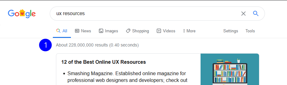
A student in the UX program at ACC has only about 4.5 months of total class time to learn a wide set of skills, tools and methods. On top of that, a search of UX resources brings up 228 million results. A student needs to sift through all of the information to find verified resources to help stay on top of it all and there is no way they could do it in such a short amount of time.
Results of "UX Resource" Google Search
How can we help students quickly find verified design resources?
Research
Plan
There were three questions I needed answered:
- What resources are students looking for?
- How are students looking for resources?
- How are students using the resources?
Interviews
I conducted 5 interviews that were 30min each. The participants were:
- Between Ages 18-50
- Austin Community College Students
Analyze
Empathy Map
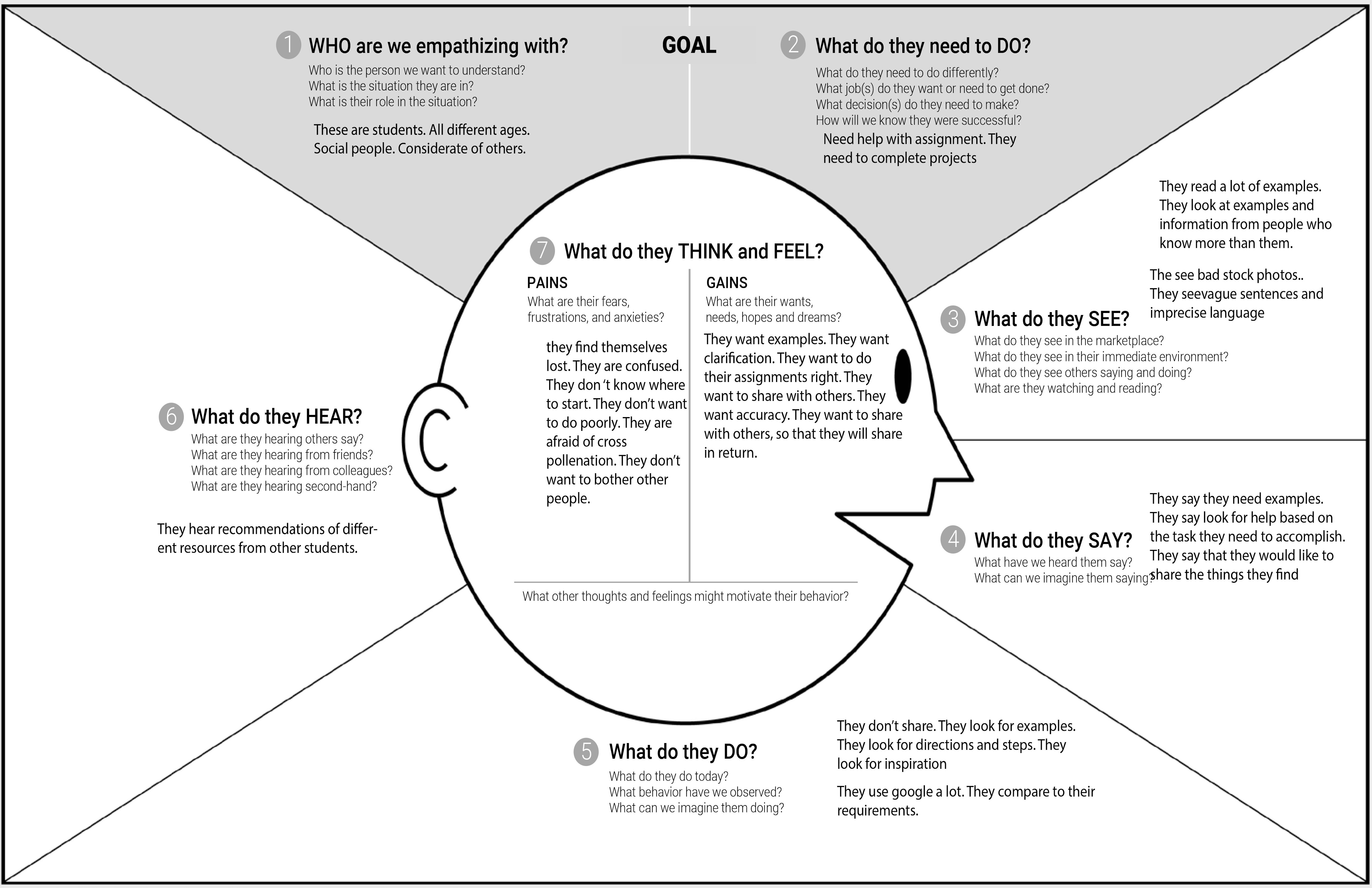
To help organize the interviewees’ responses and allow me to extract some insights, I created an Empathy Map. I was able to separate behaviors from thoughts and find contradictions while also organizing common patterns.
From the Empathy Map, I found three insights:
- Students used Google to find things that would resources to help them do work, such as tutorials.
- Since the resource was usually for a specific assignment or task, once an assignment was completed, students never reused that resource.
- Students wanted to share info but never did because of a fear of annoying others with mass emails.
Solve
Ideate
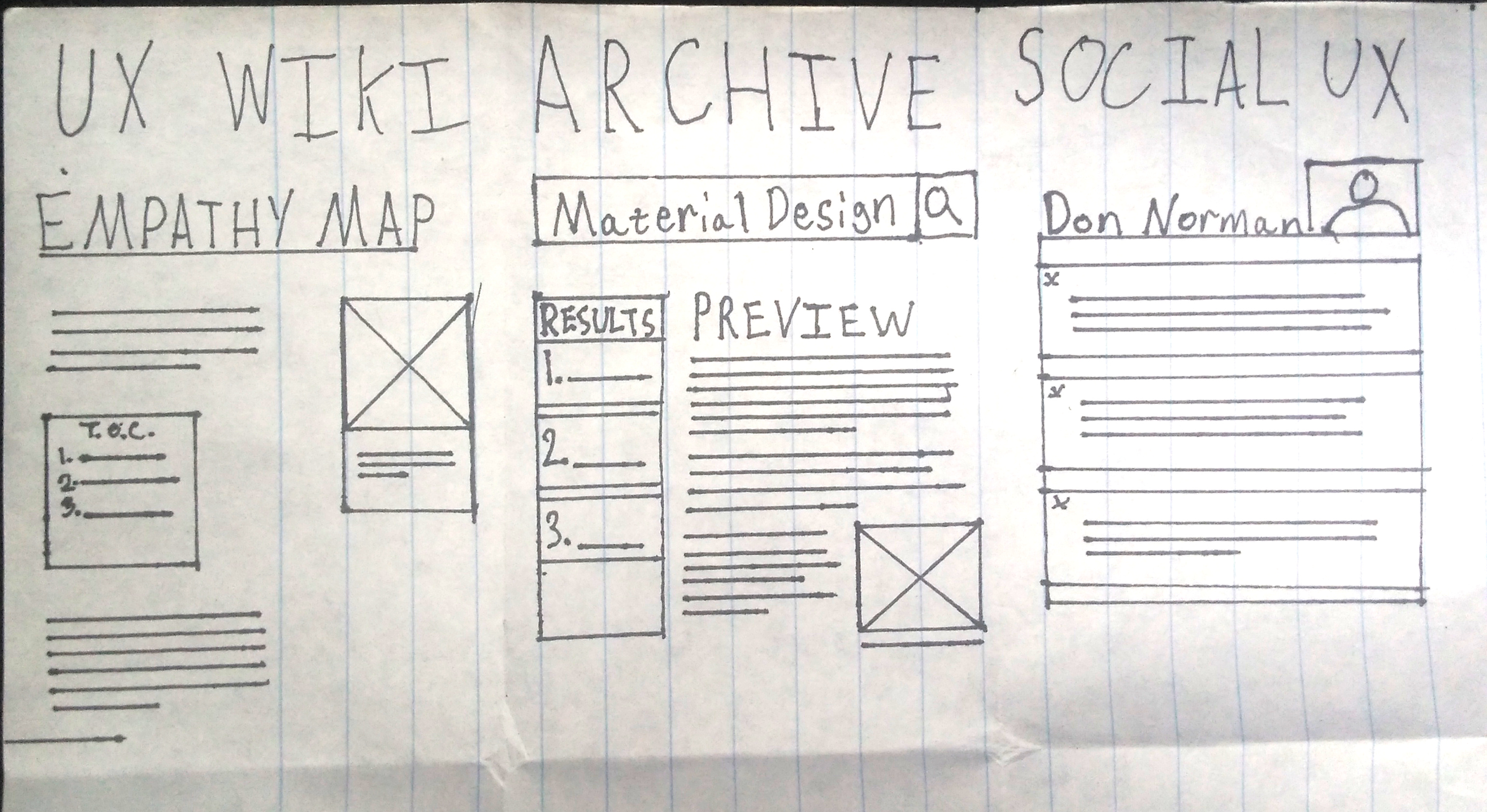
I took these insights and used Crazy Eight’s to ideate. I came up with three ideas:
- UX Wiki - A user created encyclopedia
- Archive - A place to add resources for others to use
- UX Social - A social media site for UX students
Of the three, the archive addressed the anxieties the students had about sharing. The idea is an archive like other schools but the students add things to it. This means students can share what they find with others and not annoy them. And so D’Archive was born.
Crazy Eights Results: UX Wiki (left), UX Archive (center), UX Social Media (Right)
Prototype
User Flow
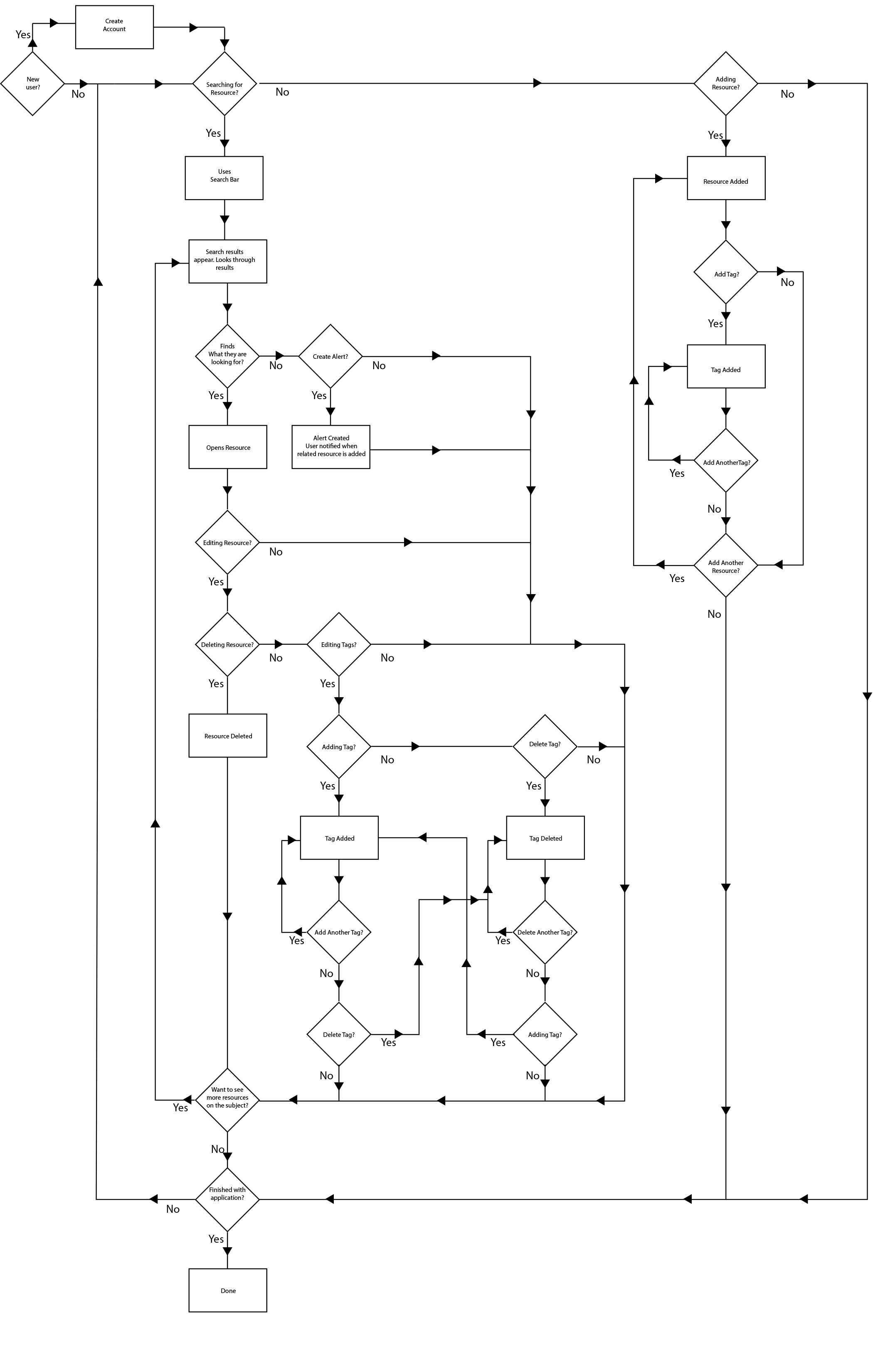
Two main parts to the archive: adding a resource and finding a resource.
- The Add feature allows students to share resources without a fear of annoying others.
- The Search feature is what lets the students find what they need.
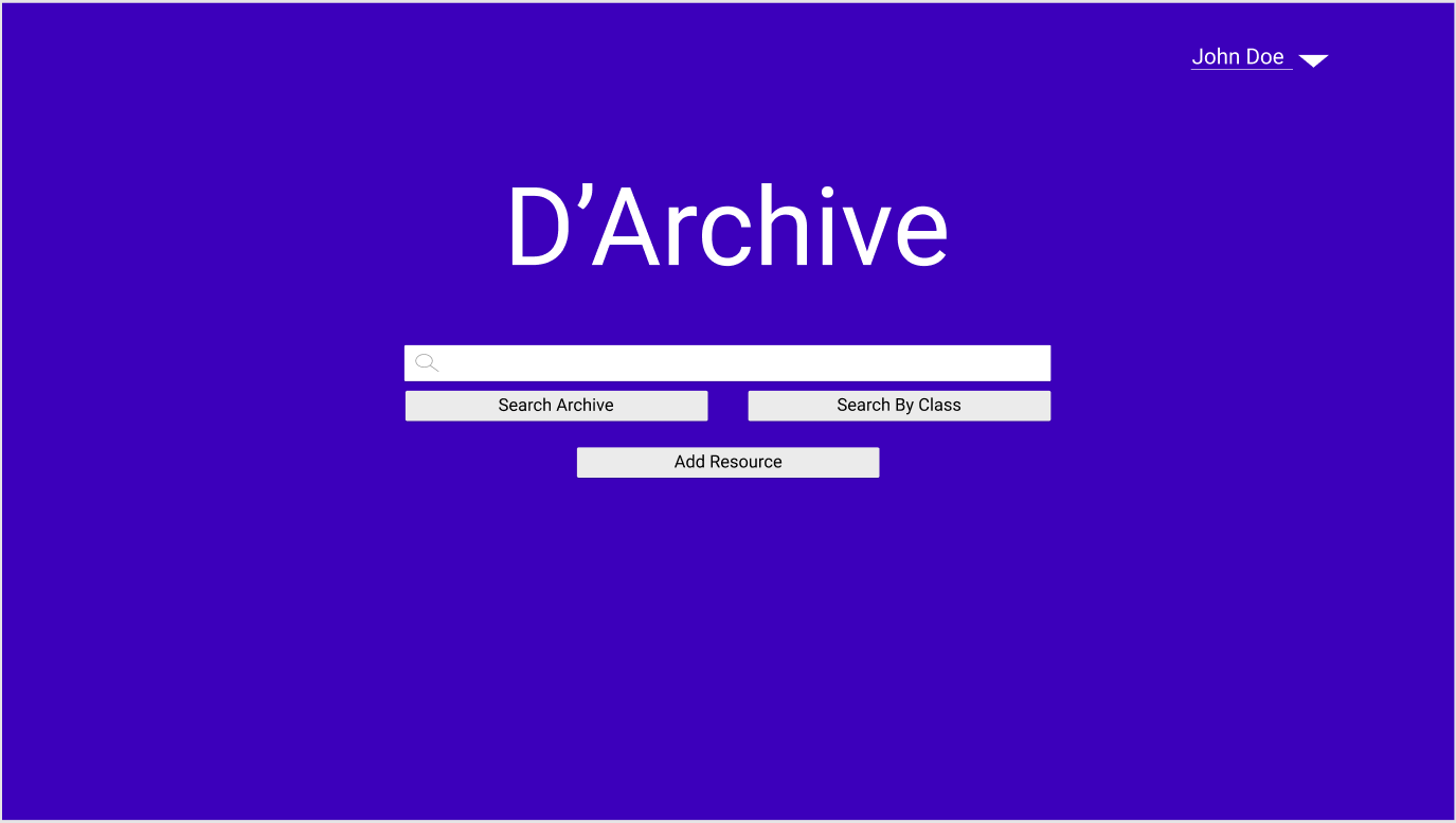
I based the minimalist design partially on Google’s Search Engine since my users were already familiar with it. The idea was if it looked like Google, people would treat it like Google, making the mental model a bit more predictable and allowing onboarding to be easier.
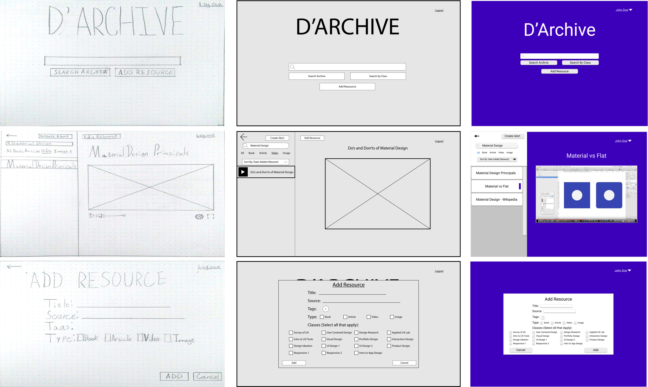
Home page Low Fidelity

Home page Mid-Fidelity
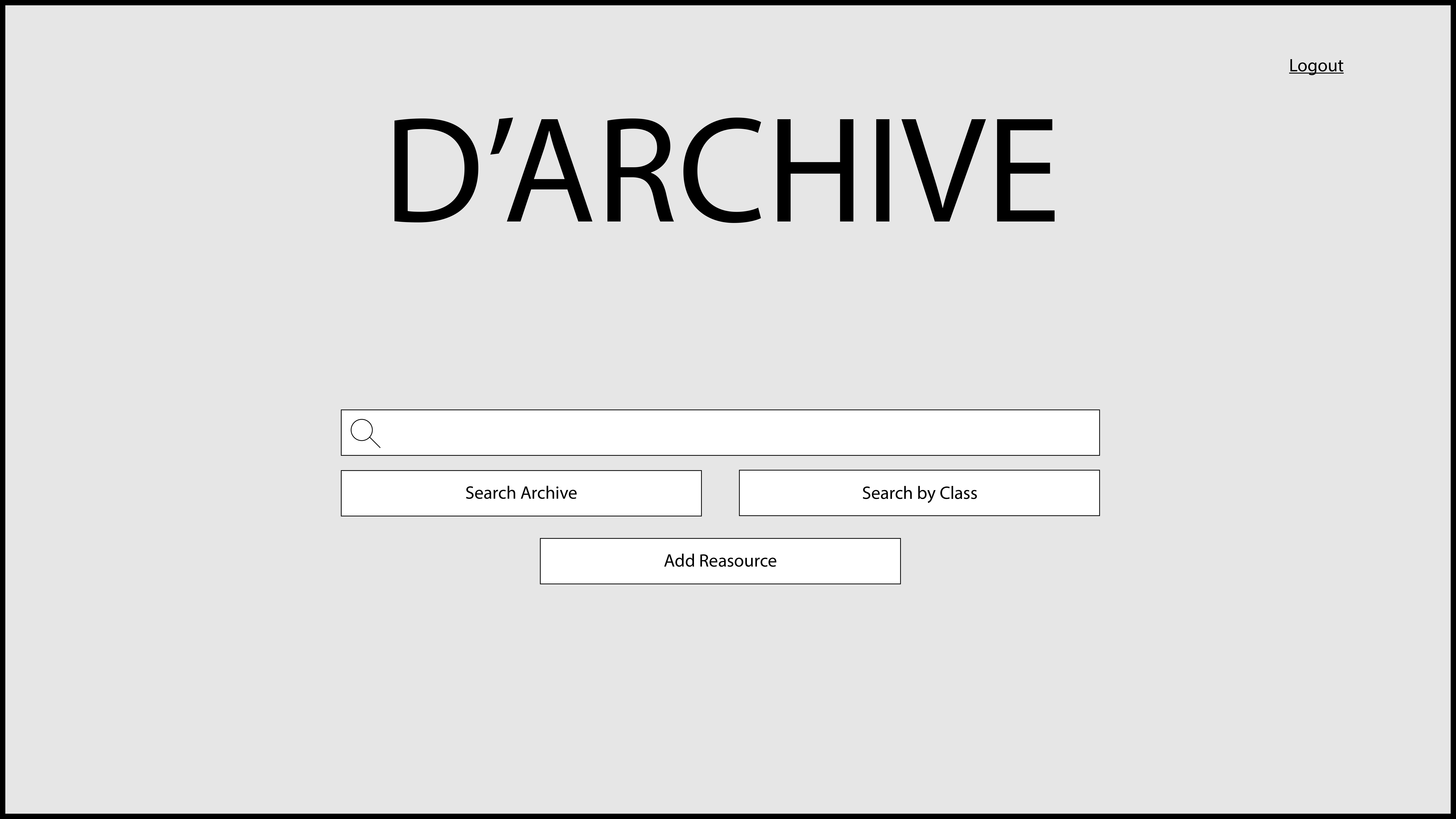
Home page High Fidelity
Search Results Page Low Fidelity
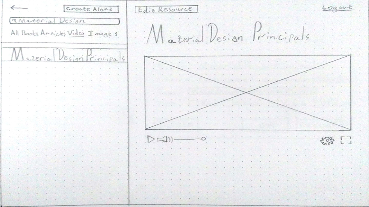
Search Results Page Mid-Fidelity
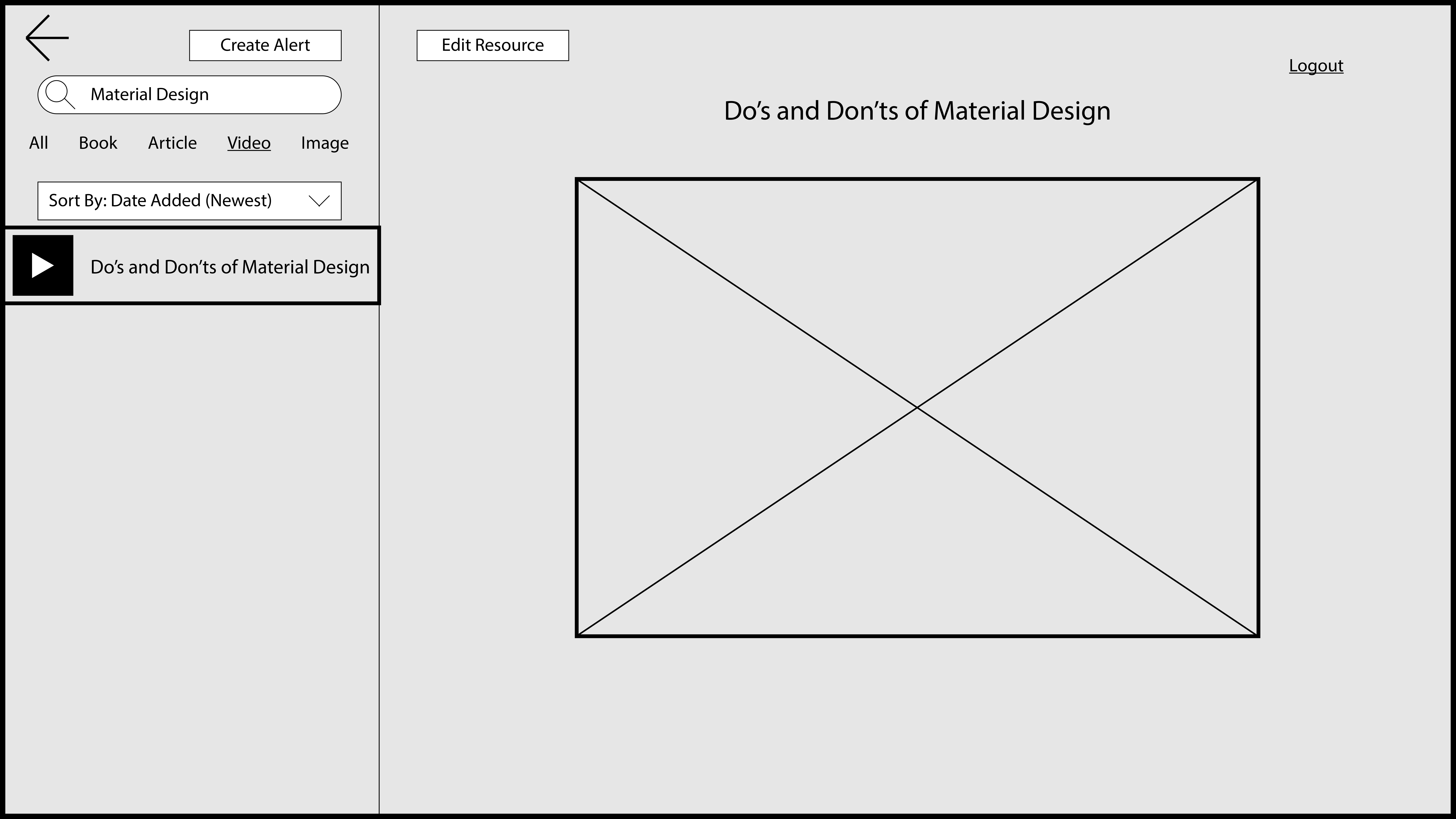
Search Results Page High Fidelity
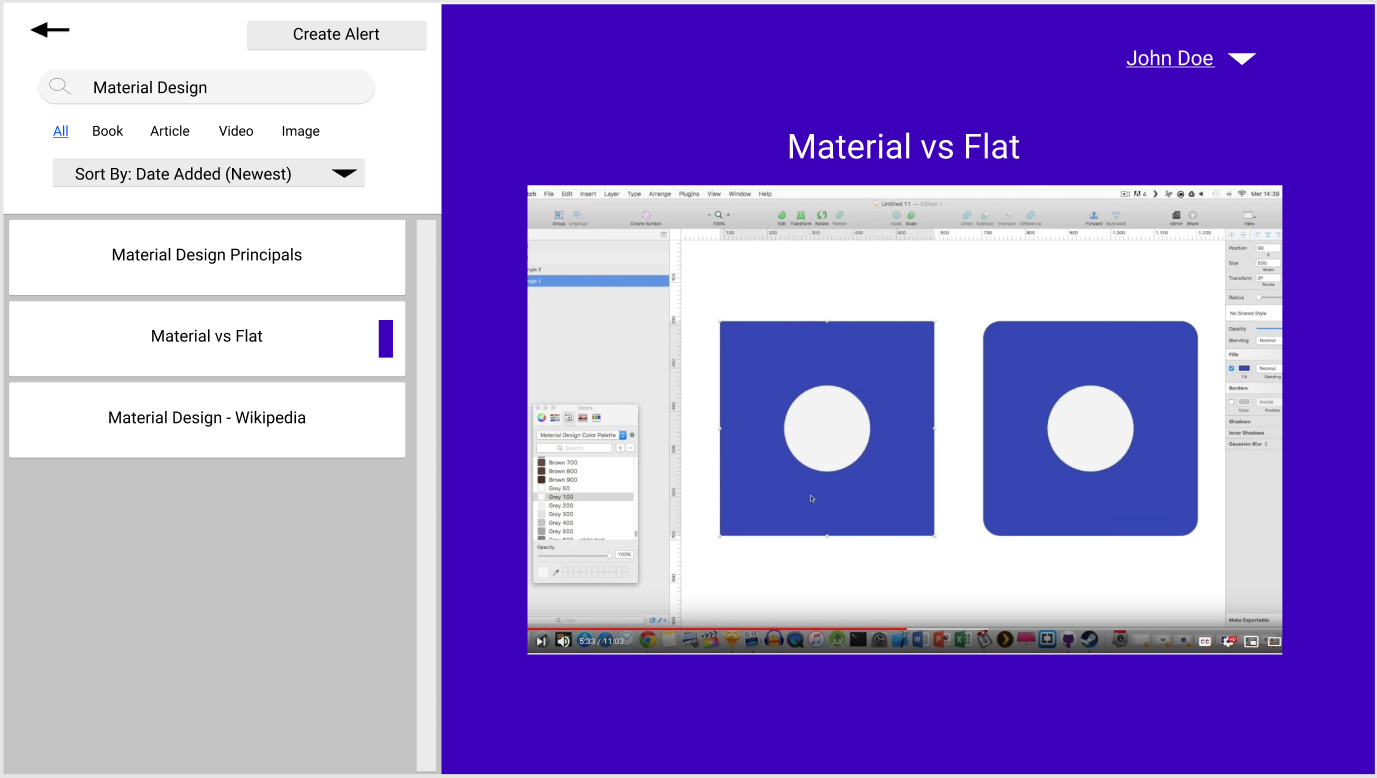
For the Search, I created a search results page that allowed you to look at the resources while still being able to see the results. This means you can switch between two results without having to leave the page, saving the students time.
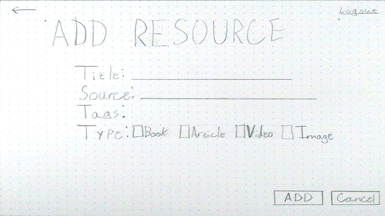
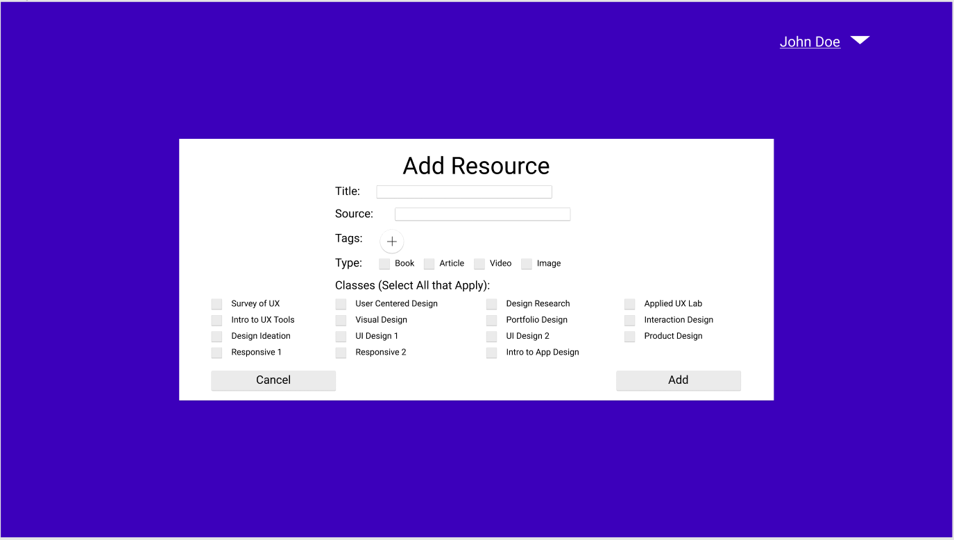
The Add feature was a very basic form that you filled out. Some of the initial feedback was that adding Tags was not obvious and that users wanted a way to link resources with specific classes to make it easier for those who don’t know what to look for. So I added a little plus button for tags and a multi-checkbox for classes, since there are only a finite number of classes. I also added a feature Search by Class so that users can find resources based on a class instead of a topic.
Add Resource Wizard Low Fidelity
Add Resource Wizard Mid-Fidelity
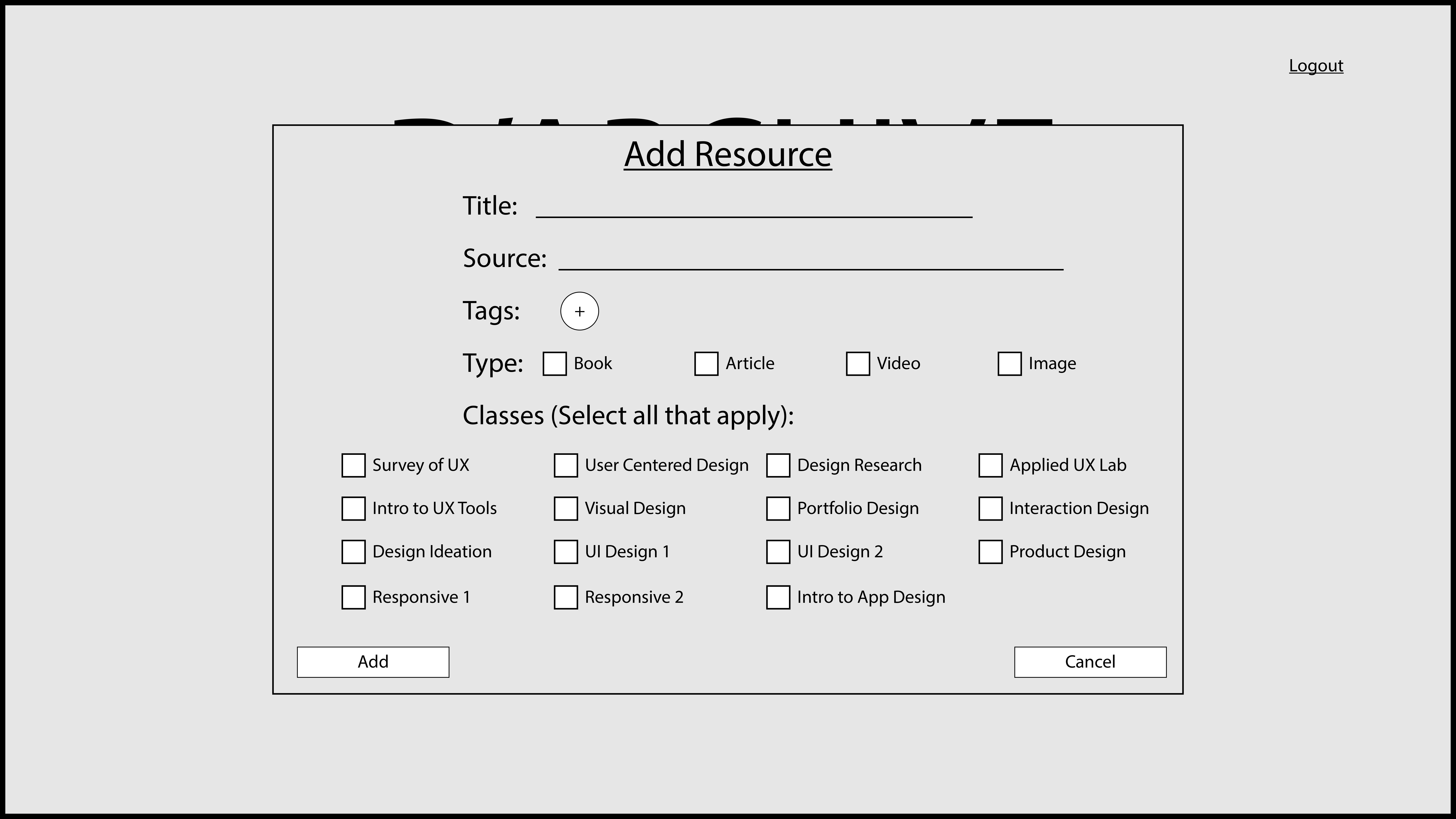
Add Resource Wizard High Fidelity
Test
Low Fidelity (left), Mid-Fidelity (center), and High Fidelity (right) screens.
I tested my design with a new group of users to see if it matched the users’ mental models. I again ran five tests with participants who were similar to my interviewees and found two big insights:
- Users did not use "Search by Class" because they did not understand what "Class" meant despite knowing that D’Archive was used schoolwork.
- made older users self-conscious about their age since they were not used to using them but knew younger people did.
Outcome
At the end of this project, I had a deeper understanding of how students look for resources to help with their education. Given this information, my design was able to leverage their preexisting knowledge as well as their desire to share.
Next Steps
The next steps are to address the issues with the words "class" and "tags". I will need something that makes class less ambiguous and some way of explaining tags.
Retrospective
A lot of things went well with this project. My users gave me a lot of good feedback and my insights from the Empathy Map allowed guided decisions on features. My User flow was also a great asset in determining features. I would like to update and test my High-fidelity one more time. I would also like to get more users and even identify any secondary users I overlooked.
It is important to note that while my users liked how my product worked, I don’t think I could legally make it. The resources being added likely have ads on the original source (like on a blog or on YouTube), and this would circumvent those ads. Also given that the EU passed Article 13, which requires platforms to be strict in preventing the unauthorized use of copywritten material, the school could get in trouble if such material is added as a resource. Future iterations would need to address this very big issue.